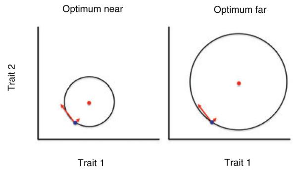
Figure 1.

Illustration of Fisher’s geometric model of adaptation, in which the trait means of the same ancestral population are indicated by a blue dot in both panels. Arrows indicate two mutations, one of large effect (long arrow) and the other of small effect (short arrow). In the right panel the ancestral population begins the process of adaptation to a distant optimum (red dot); in the left panel the optimum (red dot) is nearer to the same ancestral population. Black circles are contours of equal fitness, with fitness higher inside the circle than outside. A small effect mutation is just as likely to increase fitness in both cases, but a large effect mutation is more likely to increase fitness when the optimum is far (right panel) than when it is near (left panel); this difference is enhanced with greater numbers of traits.
