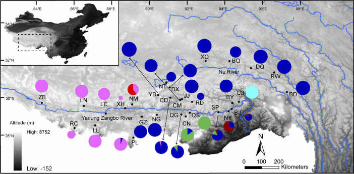
Figure 1. Map of sampling locations for Nanorana parkeri.
The pies represent the Cytb sublineage (E1–E4 and W1–W2) frequency in each population. Different colours correspond to different Cytb sublineages in Fig. 2. Abbreviations of populations are detailed in Table 1. Haplotypes of each lineage in each population are shown in Supplementary Table S2 online. The map was drawn using ArcGIS v10.1 (ESRI, CA, USA) and Adobe Illustrator CS5 v15.0.0 (Adobe Systems Inc., San Francisco, CA).

