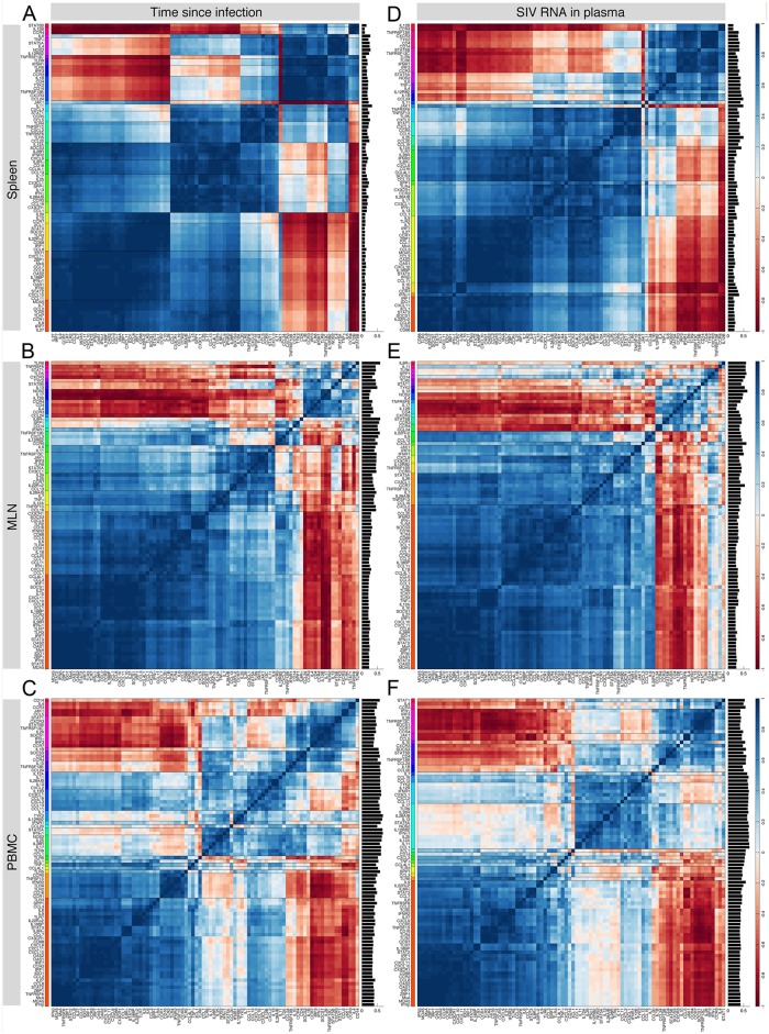
Fig 8. Average correlation coefficient matrices in all datasets, for both classification schemes.
For each of the loading plots obtained from the 12 judges, we construct a matrix of correlation coefficients. Then, we calculate the average correlation coefficient matrix from the 12 matrices for a given dataset and a classification scheme. Dark blue and red colors represent positive and negative correlations, respectively, whereas light colors represent no correlation. For each pair of genes, we calculated the standard deviation of the 12 correlation coefficients, resulting in 88 values for each gene. The mean of these values, indicative of the level of agreement between judges, is shown in a bar chart on the right hand side of each panel. Smaller values suggest higher degrees of agreement between judges on the correlation of a gene with other genes. Genes that have approximately similar correlation patterns in the dataset are grouped into 20 gene clusters (shown in different colors along the vertical axis). High resolution images of the panels are shown in S15 Information.

