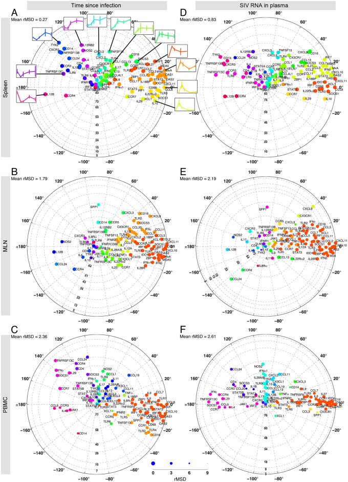
Fig 9. Correlations among genes simplified on a polar plot, illustrating MSD values and the ranking information.
The distance from the origin indicates the overall contribution of the genes in the dataset, obtained from Fig 5 and the figure in S4 Information. Therefore the high-ranking genes are located close to the perimeter while low ranking genes are located at the center. The radial grid lines define the cluster of genes that consist of significantly more (less) contributing genes than their lower (upper) neighboring clusters. These clusters are the dark and light blue clusters shown in Fig 7. The angular position of genes is extracted from the loading plots constructed by the first two eigenvectors of the average correlation coefficient matrix (S16 Information). To make the comparisons easier, the clouds of genes are rotated such that CCL8, the top contributing gene, is located at zero degrees. The genes are color-coded to match the gene clusters shown on the left hand side of each panel in Fig 8. Genes with the same color show similar patterns of correlation with other genes. The radius of each dot is linearly inversely proportional to the square root of MSD. The relationship between the dot size and the value of rMSD is shown on a scale at the bottom, where the largest and smallest circles correspond to rMSD = 0 and 9, respectively. In panel A, specific examples of gene expression dynamics typical of each cluster are shown. The complete set of gene expression dynamics is available in S18 Information.

