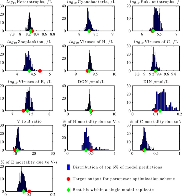
Figure 3.
Distributions of community properties obtained via nonlinear optimization. The distribution correspond to the top 5% of model feature output (blue histogram) as compared with target values (red circle), along with the properties associated with the best ranking model replicate (green diamond). The number of cases (out of 218 top-performing model replicates) are noted on the y axis.

