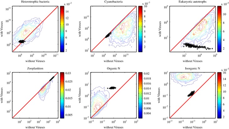
Figure 4.
Comparison of steady-state concentrations with and without viruses. The colored lines denote contours of equal probability among 4366 model replicates (obtained via Latin hybercube sampling (LHS)) that yielded a coexistence equilibrium (see main text; histograms conducted in logarithmic space as input for contour analysis). The circles denote comparisons for the 218 model replicates identified as part of the targeted nonlinear optimization procedure (see main text). The red line denotes the 1:1 line. Comparisons to results without viruses are restricted to model results where C*> 0 with the exception of the comparison of eukaryotic autotrophs. In each panel, viruses increase/decrease the pool of interest, as compared with ecosystems without viruses, when points (or contours) lie above/below the red line.

