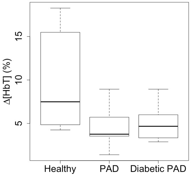
Fig. 4.
These boxplots show the distribution of Δ[HbT] at the end of the 60mmHg occlusion for each cohort. The healthy cohort has a greater minimum, maximum and quartiles than the affected cohorts, signifying more pooling in the leg. The healthy cohort has a larger range, which may be due to lifestyle choices or asymptotic circulatory problems. Also note, the affected cohorts have similar distributions despite arterial calcifications.

