
Figure 4.
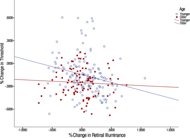
Scatterplot of the percentage change in retinal illuminance and the correlation for older and younger individuals with the percentage change in threshold. Each point represents a single measurement at each of the five noise levels. The lines represent the best-fit linear trend for each age group.