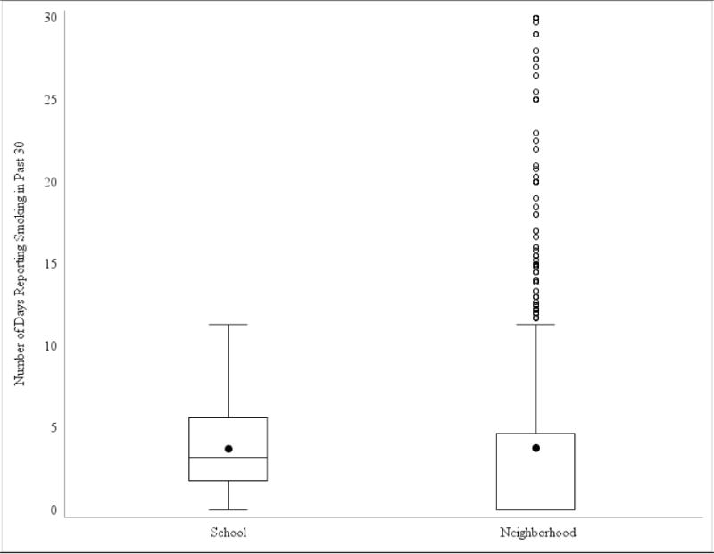
Figure 1. Distribution of the Number of Days Reported Smoking in the Past 30 Days Across Schools (N=128) and Neighborhoods (N=2,111 neighborhoods).

Box plots are presented depicting the number of days youth reported smoking in the past 30 across all schools and neighborhoods. The solid colored dot represents the mean. Horizontal lines in the boxes represent the first quartile, the median, and the third quartile of the distribution of smoking values. Vertical lines depict the 1.5 times the interquartile range of smoking for each school or neighborhood in the sample. Dots outside depict outlying values. The large number of outliers for neighborhoods was due largely to the neighborhoods including only a small number of respondents.
