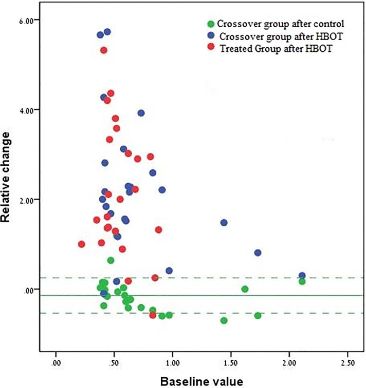
Fig 4. Scatter plot of the individual relative changes in the dolorimeter threshold.
The figure shows the relative change in all patients (y-axis in unit change) as a function of the baseline value. For the treated group, each patient is represented by a single red dot. The relative change is the change during HBOT and the baseline value is the value before treatment. For the crossover group, each patient is represented by two dots: a green dot represents the relative change during the control period, with the baseline being the value before the control. A blue dot represents the relative change during treatment, with the baseline value being the value before treatment (which is also the value at the end of the control period). The green line represents the mean relative change in the crossover group following the control period and the green dashed lines represent the ±1std from the mean.

