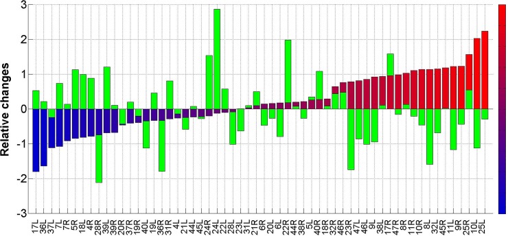
Fig 6. BA histogram of mean relative changes.
The figure shows the histogram as is explained in the text. The Y-axis shows the mean relative change <Rchange>(n) for the Brodmann area indicated in the X-axis. The results for the patients of the response group after the HBOT period are colored from light blue (BA with the strongest activity reduction) to light red (BA with the highest activity elevation). The green bars correspond to the mean relative changes in the patients of the crossover group following the control period.

