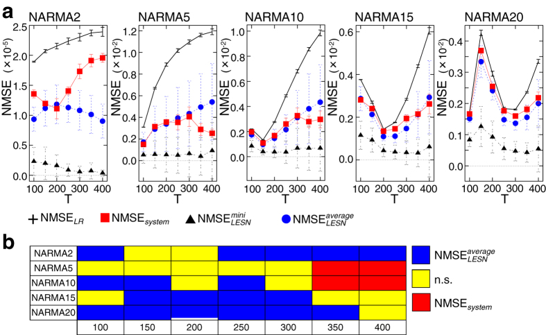
Figure 3. Comparisons among the average NMSEsystem, NMSELR,  , and for all NARMA tasks for each setting of T (a) and a diagram summarizing the significant differences between NMSEsystem and
  (b).
(b).
In (a), error bars represent standard deviations. For each task, the average NMSEsystem is significantly lower than the average NMSELR (seemingly overlapping plots in, e.g., the NARMA10 task with T = 100 and 150, the NARMA15 task with T = 200, and the NARMA20 task with T = 100 and 250, are due to the scaling of the figures), while the average  is significantly lower than the average NMSEsystem for each setting of T (Supplementary Table S1). In (b), among NMSEsystem and
  , the significantly lower one with p < 0.05 is depicted for each experimental condition. Note that “n.s.” represents “not significant.” All the information, including the average NMSEs as well as the results for significant tests in each experimental condition, is given in Supplementary Table S1.

