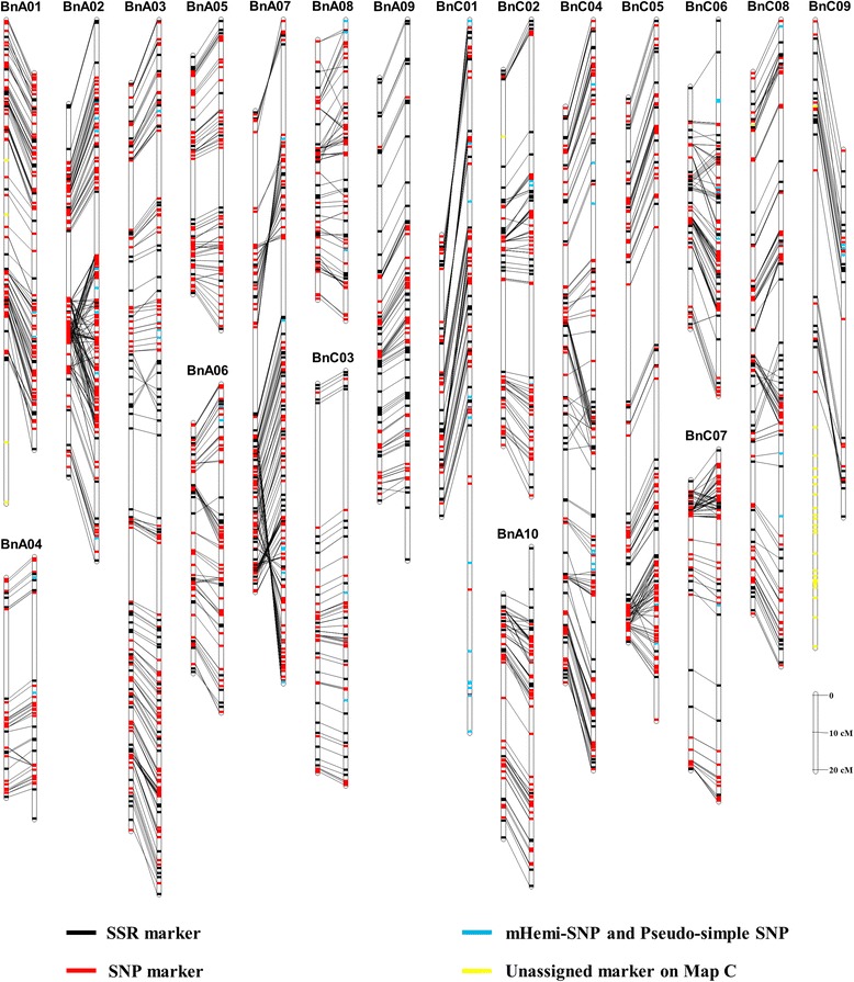
Figure 5.

Comparison of the Map B and Map C with the HJ-DH population. The left and right vertical bar of each panel represents the linkage groups (LGs) of the Map B and Map C, respectively. Each LG and markers are represented with a vertical bar and transverse line, respectively. The same markers between the LG of the Map B and Map C are connected with black lines. The simple sequence repeat (SSR), single nucleotide polymorphism (SNP), mHemi-SNP and Pseudo-simple SNP, and the marker that can only be assigned on the Map B are shown with the black, red, blue and yellow transverse line, respectively. The data of the Map C comes from Cai et al. [30].
