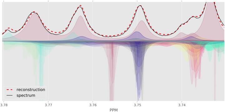
Fig 5. Evolution of Bayesil’s distributions for a small region of human serum spectrum.
The plots above horizontal axis show the original spectrum (solid black), individual clusters as well as overall fit (dashed red). The curves below horizontal axis show the Bayesil’s distribution over chemical shift variables for each cluster ( ), over 6 iterations of spectral deconvolution. The distributions become more peaked towards the correct center in each iteration. Distributions below the horizon have the color of their associated cluster.

