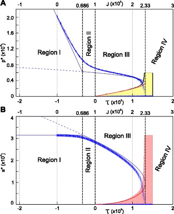
Figure 8.

Comparison between the analytically derived equilibria and the equilibria observed in CPM simulations. Shown are the analytical predictions of the equilibrium perimeter (A) and equilibrium area (B) as a function of τ, together with the numerically observed equilibrium distributions. (Parameters were chosen in such a way that ε>0, which ensures that varying only τ allows for passing through all four qualitatively different regions.) Solid blue lines indicate predicted stable equilibria, solid red lines predicted unstable equilibria with respect to size, and dashed blue lines unstable equilibria with respect to shape. Dots correspond to the numerical results. The mean and standard deviation for each τ-value were calculated by averaging over the last 1,000 MCS of 100 independent simulations. The intensity of the dots indicates the fraction of cells not disappearing. The yellow and pink area indicate the combinations of τ-value and initial perimeter and area for which in more than 50% of the simulations the cells disappeared. All simulations used a 6th level neighbourhood and R a=100 (A=31,416); P=2,000 (); λ a=0.0625; λ p=25 (); and T=20,000. The J parameter was swept over the interval [ 0, 2.5·105] ( over [ 0, 13,889]).
