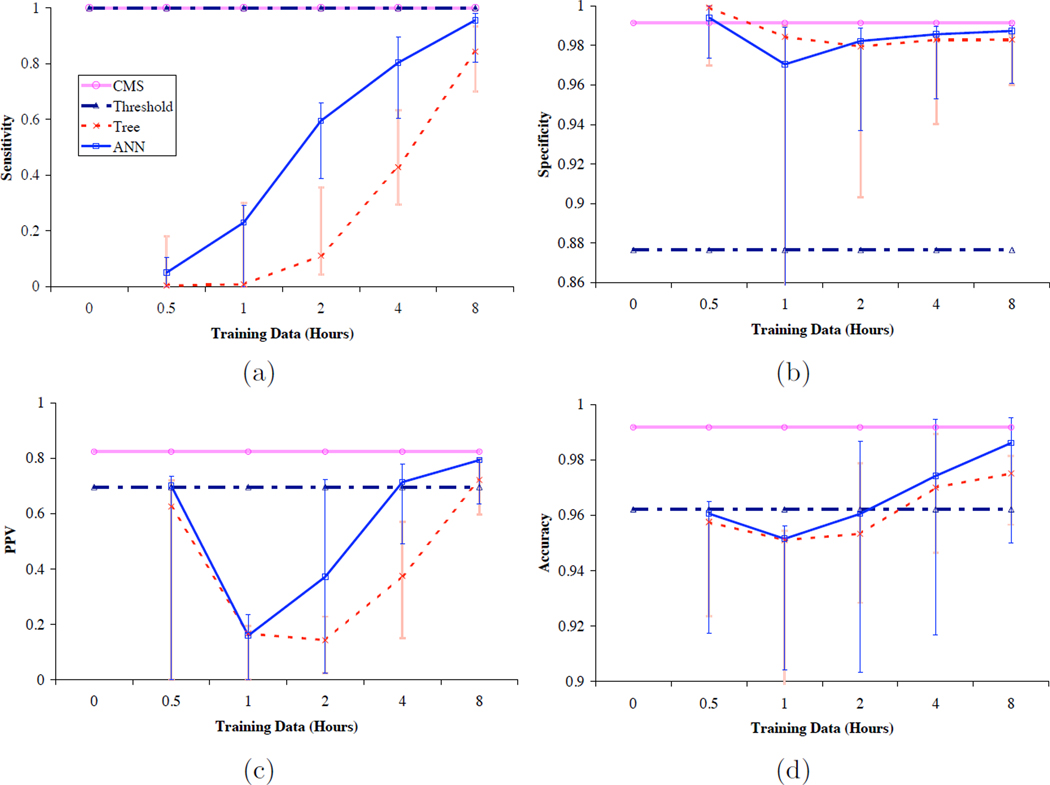
Figure 3.
Plots of averaged (a) sensitivity, (b) specificity, (c) positive predictive value, and (d) accuracy of models trained on increasing amounts of patient-specific data, compared to the performance of the CMS algorithm and a simple threshold algorithm. The horizontal axes are logarithmic in time, and the vertical axes for (b) and (d) are expanded to show differences in a narrow range of values. Vertical bars indicate the ranges of the individual values that comprise the averages. The data come from Tables 2 and 3.

