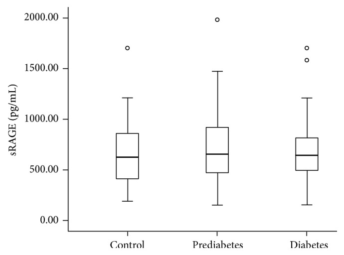
Figure 1.

Box plot showing the sRAGE concentrations in control subjects and in people with prediabetes and newly diagnosed type 2 diabetes. The line within the boxes represents the median, the bottom of each box represents the 25th percentile, and the top of the box represents the 75th percentile. The whiskers represent the 5th and 95th percentiles, and the small circles represent outliers.
