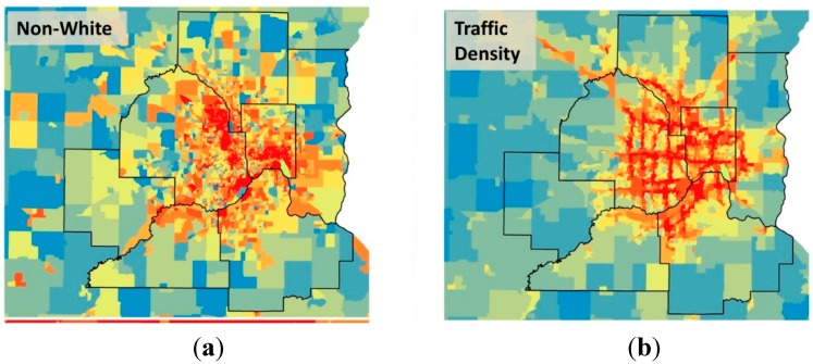
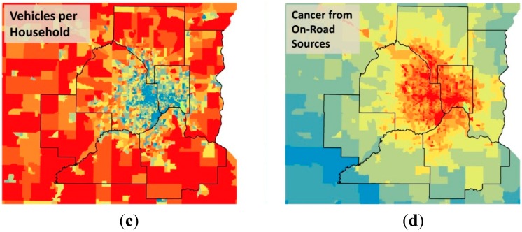
Figure 3.
The Minneapolis-St. Paul Metropolitan Area with block groups colored according to (a) the fraction non-white population, (b) traffic density, (c) vehicles per household, and (d) cancer risk from on-road sources. The color palette in all four maps increases from blue to red by decile of the metric. The seven counties in the Metro Area are shown in bold outline.


