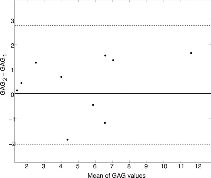
Figure 5b:
Test–repeat test results for masked FG of 10 healthy subjects. Bland-Altman plots for (a) APTLor and (b) GAGLor show the difference between the mean image values for each subject (black dots) plotted against the mean of the respective CEST-derived metric. The mean difference values (solid black lines) and limits of agreement (dotted gray lines) are shown for both metrics.

