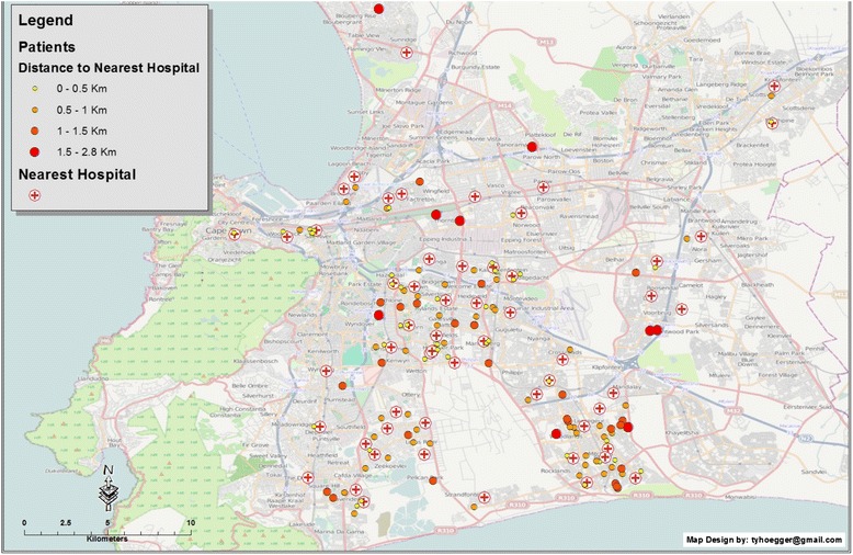
Fig. 3.

Map showing the patients’ residences (blue circles) and INR clinics (red cross within circle) using graduated symbology to represent the distance to the nearest clinic for potential INR monitoring, represented by graduated circles in size and colour ranging from yellow (0–0.5 km) to red (1.5–2.8 km)
