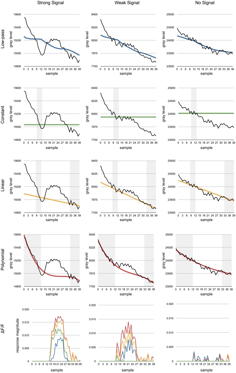
Fig 3. The results of applying the different methods to the example data from Fig 1.
The grey regions indicate data used for the approximation of the background function F which is shown in different colours. The black line shows the raw signal. Left column. All of the methods are able to recover the signal when it is sufficiently strong. Center column. A weaker signal will be lost if a constant background is used. Right column. None of the methods produce significant responses when the is no signal. Bottom row. The recovered responses based on each of the different methods. The colours are the same as used in the top four rows (blue: low-pass, green: constant, yellow: linear, red: polynomial).

