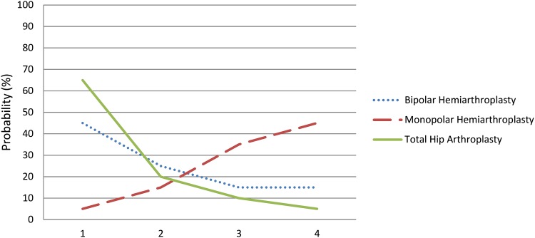
Fig. 2.
A rankogram plots the probability of each rank for each treatment. In this hypothetical figure, THA (green solid line) has a higher likelihood of being the best treatment compared with either monopolar (red dashed line) or bipolar (blue dotted line) hemiarthroplasty. Through visual depiction, ranks are shown as probabilities rather than absolute values.

