
Figure 2.
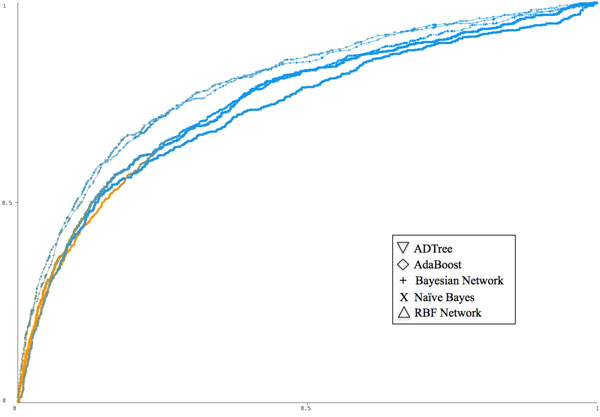
ROC curves comparing five classifiers run over the disease-protein network data set. The top two performers were ADTree and AdaBoost (both AUC = 0.795), followed by the Bayesian network and the Naïve Bayesian classifiers (both AUC = 0.754), and finally the RBF network (AUC = 0.726). The curves are colored according to the threshold value and based on a color gradient scale from blue (threshold value of 0) to orange (threshold value of 1). This figure was created using Weka [40].