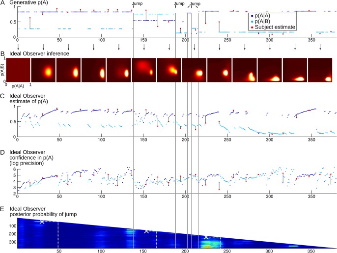
Fig 2. Example of the time course of a full session.
(A) Each dot represents a stimulus in the sequence (dark blue = A, light blue = B). The position on the y-axis shows the true generative probability of having the stimulus A at a given trial, which is conditional on the preceding stimulus. The 5 changes in transition probabilities are highlighted in gray. The red dots show the subject's probability estimates that the next stimulus is A (the answer to Question 1 in Fig 1). The black lines facilitate visual comparison between the subject's estimates and the corresponding generative values. (B) Temporal evolution of the distribution of transition probabilities estimated by the Ideal Observer. The distribution is updated at each observation, but it is plotted only every 30 stimuli for illustration purposes. The distribution is two-dimensional: p(A|A) and p(A|B) can be read as marginal distributions along the vertical and horizontal axes. Point estimates and the related confidence levels can be read respectively as the mean and negative log variance. (C) Temporal evolution of Ideal Observer point estimates of the transition probabilities. The transition probabilities estimated by the Ideal Observer sometimes differ substantially from the generative ones, and better account for the subject's estimates, e.g. around stimulus 240. (D) Temporal evolution of the Ideal Observer confidence in the estimated transition probabilities. Confidence levels from the Ideal Observer and the subject cannot be compared directly: subjective reports were made on a qualitative bounded scale (Question 2 in Fig 1) whereas the Ideal Observer confidence in principle is not bounded. For illustration purpose, subjective confidence levels (red dots) were overlaid after adjusting their mean and variance to match those of the Ideal Observer. Several features are noteworthy: drops of confidence levels after suspicion of jumps (e.g. around stimulus 50) and a general trend for confidence to increase with the number of observations within a chunk (e.g. from stimulus 1 to 50). (E) Evolution of the posterior probability that a jump occurred around (±5) each stimulus of the observed sequence, as estimated by the Ideal Observer. Hotter colors denote higher probabilities. This estimation is revised after each new observation. The successive estimations result in the succession of longer and longer rows as more and more stimuli are observed in the sequence. Jumps reported by the subject are overlaid as white crosses. For instance, at stimulus 50, the subject pressed the detection key to report a jump located at stimulus 30. This detection was actually a false alarm with respect to the generative jumps, but the Ideal Observer also estimated that a jump was likely at this moment.

