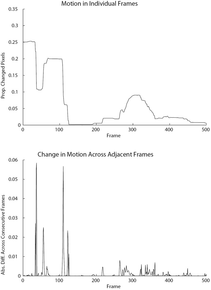
Fig 5. These graphs display a 500 timestep segment of a sample motion time series.
The top graph shows motion in individual frames as the proportion of changed pixels per frame, while the bottom graph shows the absolute difference of the proportion of changed pixels per frame across consecutive frames, i.e., the change in motion across adjacent frames. Periods of stable motion in the top graph are reflected by small spikes in the absolute difference graph, i.e., small changes in motion across adjacent frames. Sharp increases or decreases in motion are reflected by larger spikes, indicative of larger changes in motion across adjacent frames.

