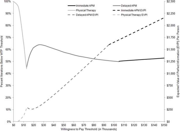
Fig 4. Cost-effectiveness Acceptability Frontier and Expected Value of Perfect Information.
Fig 4 contains two categories of reported results. The first is the cost-effectiveness acceptability frontier, described by solid gray and black lines at the top half of the graph. The frontier describes the likelihood that the strategy with highest NMB at any given WTP threshold is cost-effective, where likelihood is defined as a probability on the left-most Y axis. NMB is calculated by subtracting the cost of a treatment strategy from the product of a strategy’s effectiveness and a given WTP. The bottom half of the graph describes the EVPI reported for each WTP threshold for the strategy defined as preferred under that threshold. EVPI results are represented by dotted lines in dollars per person by the right-side Y axis. Time costs were not included.

