
Fig 2. Differential expression of genes in white adipose tissue from subjects with acromegaly compared to controls.
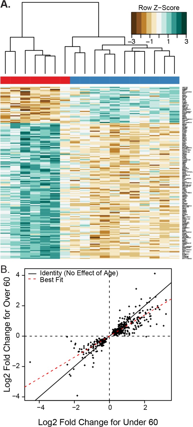
A) Heatmap of the differentially expressed genes in white adipose tissue. Individual values are colored as the log fold change for a particular gene in a particular subject compared to the average expression of that gene across all cohorts, with brown indicating less expression and green indicating more expression (designated in the key as Row Z-score). The bar across the top indicates the subject’s diagnosis, red for acromegaly and blue for controls. B) Scatterplot showing the log2 fold change for genes which had a statistically significant difference (q<0.05) between acromegaly and control subjects. Each dot represents the log2 fold change for acromegaly for a gene in the under 60 and 60 or over cohorts. The solid line represents a slope of 1, which would imply no difference in fold change between age groups. The red line is a best fit line with a lower slope, showing that on average the fold change for older patients is smaller than the fold change for the under-60 patients.