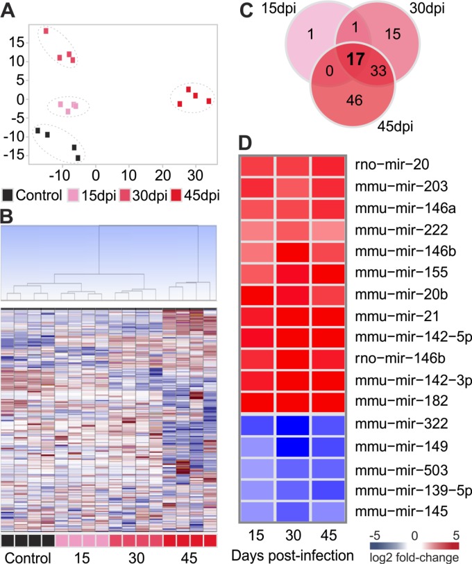
Fig 3. Characterization of microRNA expression profile.
A: Principal component analysis (PCA) plot of samples was performed using all probe sets, by using a median centering of the data set. B: Hierarchical clustering based on squared Euclidean distance measure and Ward's method for linkage analysis and Z score normalization. Each line represents one microRNA and each column represents one sample. The colour scale illustrates the microRNAs relative expression (ΔCt) after global normalization; red and blue represents upregulation and downregulation, respectively. Each square represents one sample. C: Venn diagram showing the number of differentially expressed microRNAs in each time point. D: Heat-map showing the fold change over control for the 17 miRNAs expressed in all time points post infection. The colour scale illustrates the fold change in microRNAs expression relative to uninfected controls; red and blue represents upregulation and downregulation respectively. Each square represents the group mean.

