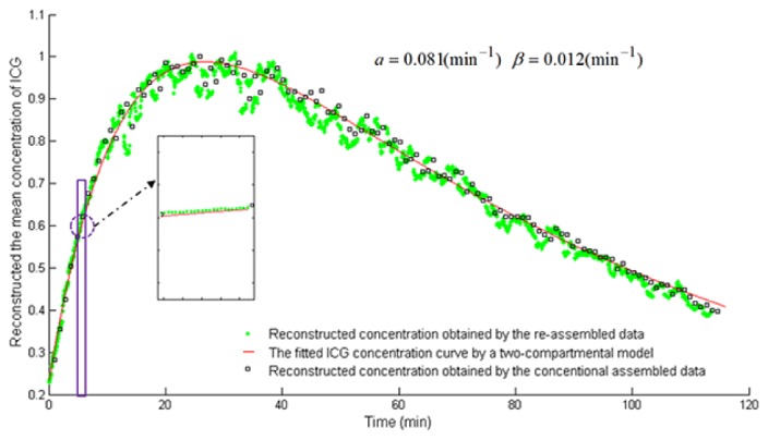
Fig. 11.

The time course of ICG in the mouse liver in vivo. The X axis represents the time (min). The Y axis represents the mean concentrations of ICG, which are normalized by its maximum value. The green asterisks and black rectangles describe ICG time course obtained by using the re-assembled measurement data (2880-frame) and the conventional assembled measurement data (120-frame), respectively. The red line describes the fitted ICG time course using a two compartmental model [19].
