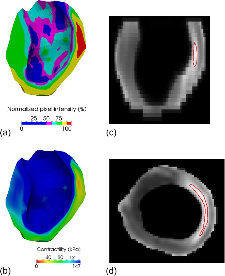
Fig. 5.

(a) Viability map in early diastole. Healthy regions (low pixel intensity) appear in blue, while the infarcted region (high pixel intensity) appears in red. (b) Personalized contractility map determined through numerical optimization. The colors are inverted compared to those in the viability map, so that the regions are consistent: healthy regions (high contractility) appear in blue, while the infarcted region (low contractility) appears in red. Note that because the core infarct area is rather small, the region with zero contractility (red) is small as well. (c) Contour plot, in a long-axis plane, of the 95% normalized pixel intensity, which corresponds, according to the material optimization, to the area with less than 10% contractility compared to the remote region. (d) Same contour plot, as in (c), in a midventricular short-axis plane.
