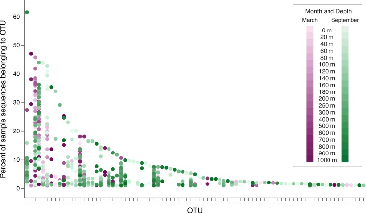
Figure 5. Percent of sample sequences falling in an OTU versus OTU.
The dots represent samples and are color-coded to indicate month and depth. Samples from March 2010, September 2010, March 2011, and September 2011 are displayed in this plot. The September 2008 samples are not included in order to avoid overemphasizing seasonal differences (March 2008 was not sampled). The plot considers the 83 OTUs that contain ≥1% of the sequences from at least one sample from 2010 or 2011. Because the September 2008 samples are not included, the 83 OTUs displayed in this figure are a subset of the top 94 OTUs. No dots are displayed in OTU columns for samples in which less than 1% of the sample’s sequences belong to that OTU. OTUs are arranged along the x-axis in descending order of largest contribution to any single sample.

