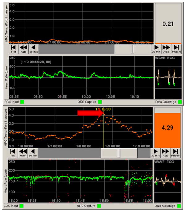
Figure 4. Contrasting normal and abnormal patient data on the HeRO (HRC) monitor.
Top panel: Still photo of patient in a NICU. The bottom half represents 30 minutes of heart rate data (green tracing, in beats per minute). Note the normal variation in heart rate. The top half represents 5 days of continuous HRC output, representing a fold increase in risk of sepsis over the next 24 hours (orange tracing). The HeRO score (HRC index) at the time was less than 1, indicating a low risk of developing sepsis. Bottom panel: By contrast, a still photo of a different patient shows a heart rate tracing with frequent decelerations. The corresponding HRC tracing has a spike (red arrow) corresponding to a HeRO score of 4.29. When this photo was taken, this patient was over four times more likely to develop sepsis in the next 24 hours when compared to similar patients in a control sample.

