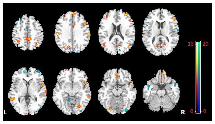
Figure 2.
The discrimination maps for ReHo. Regions displayed were identified by setting the threshold to ≥30% of the weight vector scores. Warm color (positive value) indicated higher discriminated values in SAD than in healthy controls; cool color (negative weights) indicates higher values in healthy controls than in SAD.

