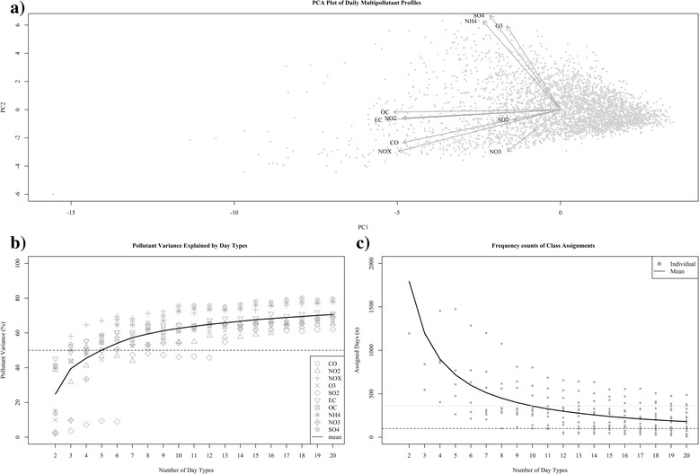
Fig. 1.

Graphical and statistical evaluation measures used to aid in selection of number of day types. Panel a presents a principal components analysis (PCA) projection of our multipollutant data. The grey points represent the scores for daily observations along the first two principal components and the dark arrows indicate the corresponding loading vectors for each pollutant. Panel b displays the distribution of adjusted R2 values from simple regression models fit to each pollutant as a function of the number of day types. Each pollutant has a unique symbol and the trend line reflects the mean. Panel c displays the distribution of frequency assignments to each day type. Grey points reflect observed frequencies and trend line reflects the mean
