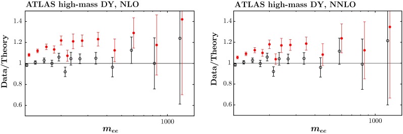
Fig. 10.

The fit quality for the ATLAS high-mass Drell–Yan data set [83] at NLO (left) and NNLO (right). The red points represent the ratio of measured data to theory predictions, and the black points (clustering around Data/Theory 1) correspond to this ratio once the best fit has been obtained by shifting theory predictions relative to data by using the correlated systematics
