
Fig. 18.
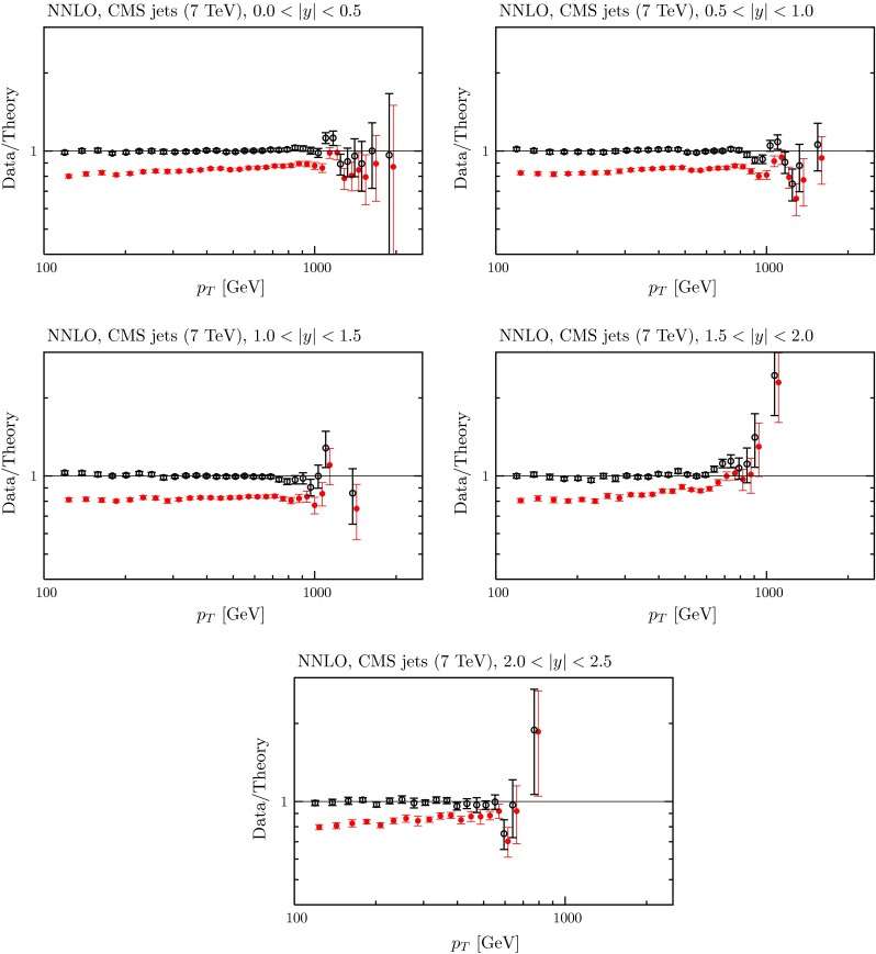
The fit quality for the CMS jet data [106] at NNLO, using the ‘larger’ -factor described in the text. The red points represent the ratio of measured data to theory predictions, and the black points (clustering around Data/Theory 1) correspond to this ratio once the best fit has been obtained by shifting theory predictions relative to data by using the correlated systematics