
Figure 1E.5.10.
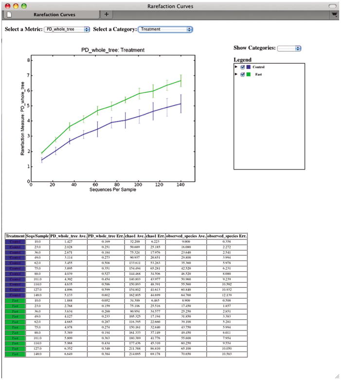
A Web browser window displaying rarefaction plots. The vertical axis displays the diversity of the community, while the horizontal axis displays the number of sequences considered in the diversity calculation. Each line on the figure represents the average of all microbial belonging to a group within a category: here the green line represents all fasted mouse communities, and the blue line represents the control communities.