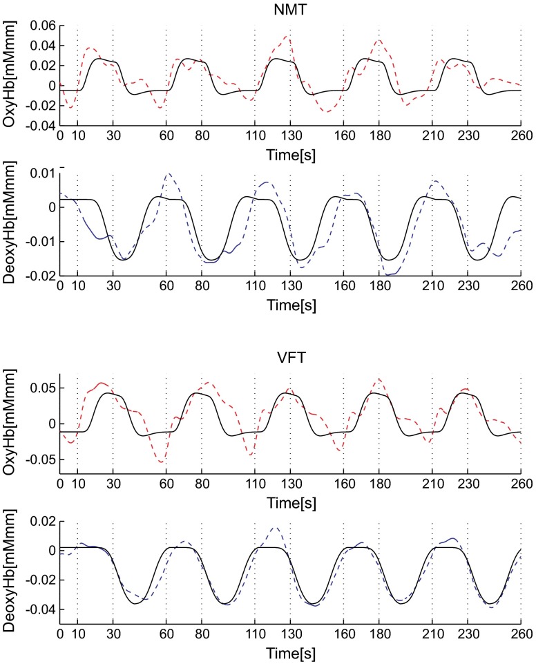
Fig. 2.
The observed timeline data for fNIRS and optimized HRF for two signals and for two tasks. The upper two graphs are the data for the NMT (naming task) and the lower two are those for the VFT (verbal fluency task). The red dashed lines indicate the observed timelines for oxy-Hb signal and the blue dashed lines indicate deoxy-Hb signal. The observed timeline data are the grand-average data across all participants and channels. The black solid lines indicate the HRFs, which were calculated using the optimal values for each condition.

