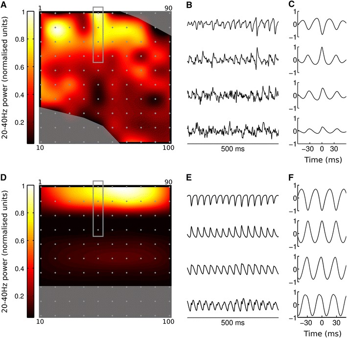
Fig. 9.

Comparison of experimental (a–c) and simulated (d–f) MEA recordings. a Map of gamma frequency power across the electrode array in vitro. Electrode positions shown as grey dots, corner numbers indicate electrode IDs. Shaded areas show where electrodes were discounted because they fell either outside the slice boundaries or within the white matter. Gamma power is strongest at the top of the slice, corresponding to L2/3. b Example experimental LFP traces from electrodes 41–44 (indicated by grey rectangle in a). Traces have been normalised to unit standard deviation for ease of comparison. c Cross correlation of signals from electrodes 41–44 with signal from electrode 42, illustrating phase inversion in the signal from electrode 41. This electrode was identified as being in layer 1 by post hoc histology (not shown). Gamma map and cross-correlations estimated from 18 s of data. d–f as a–c, but for the neocortical slice model (gamma map and cross-correlations estimated from 1.5 s of simulation data)
