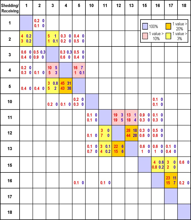
Fig 6. Percentage of hours when the viral concentrations arising from worst case (red) and vaccinated (blue) scenario disease outbreaks at (shedding) farms in April (upper line) and July (lower line) exceed minimum infective dose thresholds at nearby (receiving) unvaccinated farms.
See Fig 1 for farm locations. Shedding farms are along the y-axis and receiving farms along the x-axis. Blanks denote zero, decimal places are only shown for nonzero values less than 1, and diagonal (100%) values are shaded in light blue. Boxes with at least one value larger than 20%, 10% and 3% are shaded in orange, yellow, and pink, respectively.

