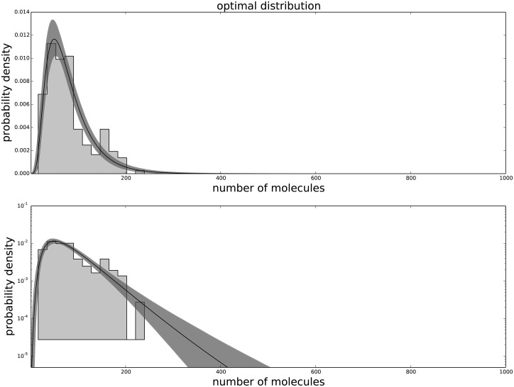
Fig 3. The agreement between the data and the fitted distribution for the tenth passage.
The upper graph is linearly scaled, the lower one is logarithmically scaled to show the distribution at high n. The black line is the best estimated distribution, while the gray area represents the uncertainty in the distribution.

