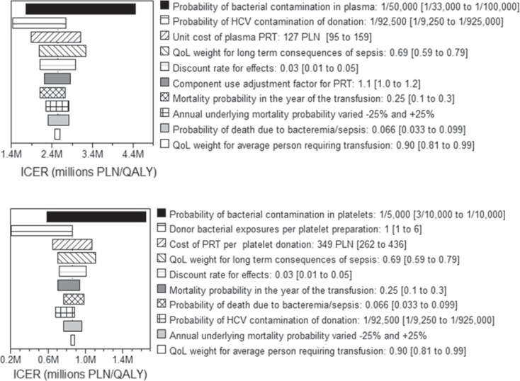
Fig. 1.
Tornado diagrams ranking the top most influential variables by providing the ICER ranges associated with each variables' estimated upper and lower bounds. a provides the most influential variables in the comparison of P-PRT to current screens and b provides the most influential variables in the comparison of PP-PRT to P-PRT. The legend for each plot provides the description of the variable, followed by the point estimate and the range used in one-way sensitivity analysis in brackets. The variable value producing the lower ICER result (left edge of each horizontal bar) is written first and the higher ICER is presented second. QoL = Quality of life.

