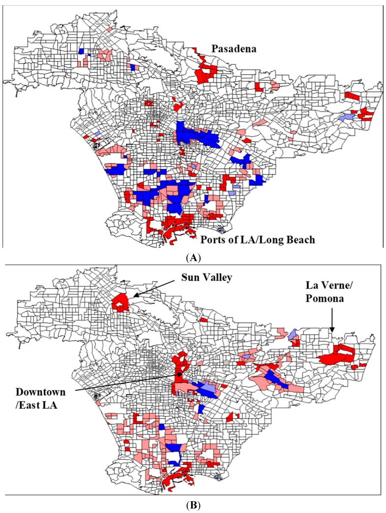
Figure 1.
(A) Change in HAPs 1989–2002, I = .0653 (B) Change in Toxicity-Weighted HAP Releases 1989–2002, I = 0.027. Bright red areas represent census tracts with an increase in HAP emissions, surrounded by other census tracts with increased HAP emissions (“high-high”), statistically significant at the 0.05 level. Pale red areas represent census tracts with increased HAP emissions, surrounded by decreased HAP emissions (“high-low”). Pale blue areas represent census tracts with decreased HAP emissions, surrounded by increased HAP emissions (“low-high”). Bright blue areas represent census tract with decreased HAP emissions, surrounded by decreased HAP emissions (“low-low”).

