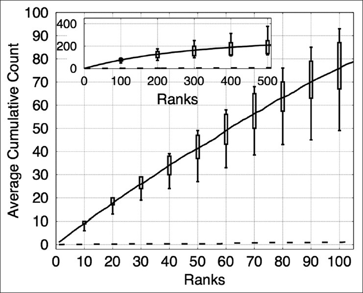
Figure 9.

The plot shows the cumulative counts averaged over nine images versus ranks for prominent nucleoli patterns detected in the renal cell papillary cancer dataset. The result for an algorithm that randomly ranks the pixels (dashed line) would fare much worse detecting only about 1% correct prominent nucleoli on average among its top 100 objects. The inset figure shows the average cumulative count curve for 500 ranked objects. The box plots indicate the first and third quarters of the data distribution. Horizontal bars show the highest and lowest cumulative counts
