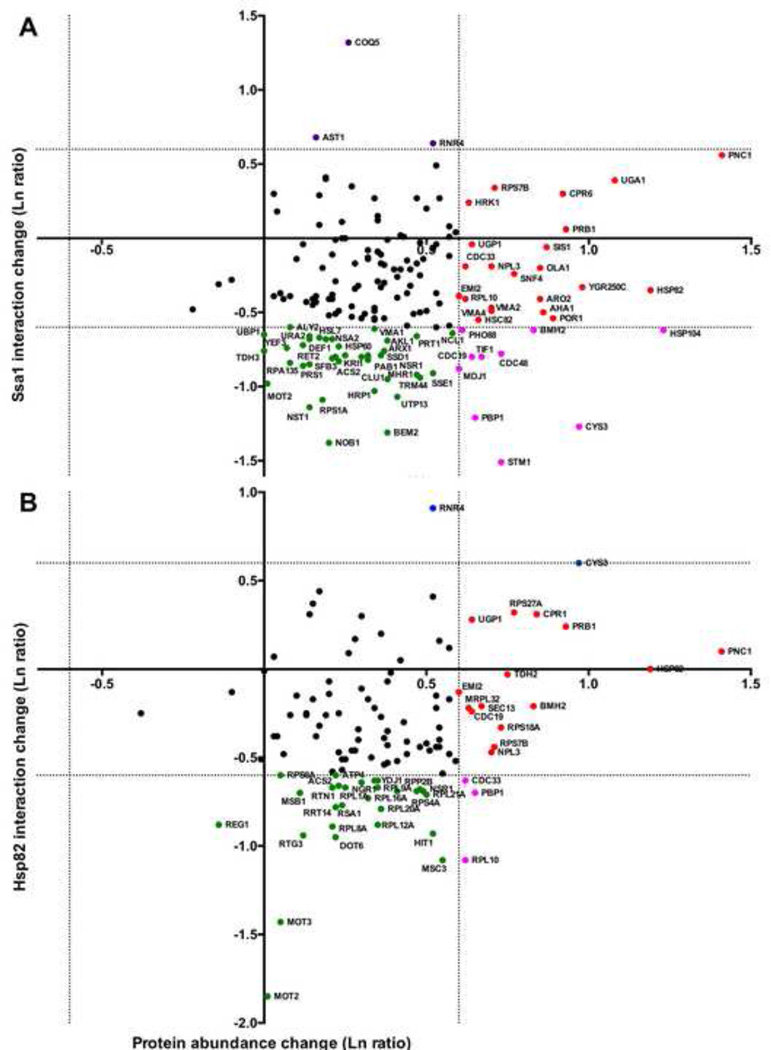
Figure 5. Analysis of Ssa1/Hsp82 interactions in comparison to protein abundance changes during MMS treatment.
Where possible, interactors were plotted with the x-value corresponding to change in chaperone interaction (our data) and y-axis value the total protein abundance change (obtained from [2]). The dotted lines represent a change in either chaperone binding or protein levels of two-fold up or down. Interactors were colored according to significant change in chaperone association and/or protein abundance upon DNA damage as follows: green (decreased chaperone association), red (increased protein abundance), pink (decreased association, increased abundance), or black (no significant changes in association or abundance).

