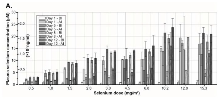
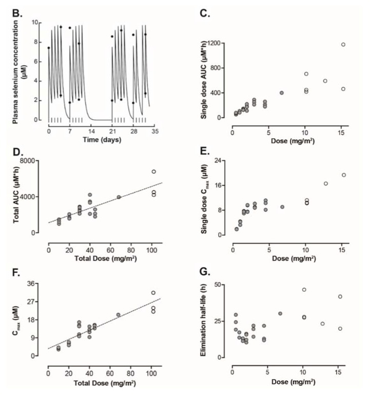
Figure 3.
(A) Plasma selenium concentration in different cohorts receiving increasing concentration of sodium selenite during the first two-weeks of treatment. (B) Plasma selenium concentration–time curve in Patient 9. The daily dose (1.5 mg/m2) was given as a 20 min constant rate infusion. Start of infusions is indicated by the vertical lines. Measured serum concentrations are given by the filled circles. (C,D) Systemic selenium exposure is expressed as area under the serum concentration–time curve (µM*h). Figure 3C shows data from a single dose of selenite and data from the entire treatment period are presented in Figure 3D. (E,F) Figure 3E represent maximum concentration of selenium after a single dose of selenite. Maximum concentration of selenium during the entire treatment period is presented in Figure 3F. (G) Elimination half-life of selenium at different doses. In all the figures, filled circles indicate data from 20 min infusions and open circles data from 40 min infusions. Abbreviations: BI—before injection; AI—after injection; AUC—area under curve; and Cmax—maximum concentration 162 × 253mm (300 × 300 DPI).


