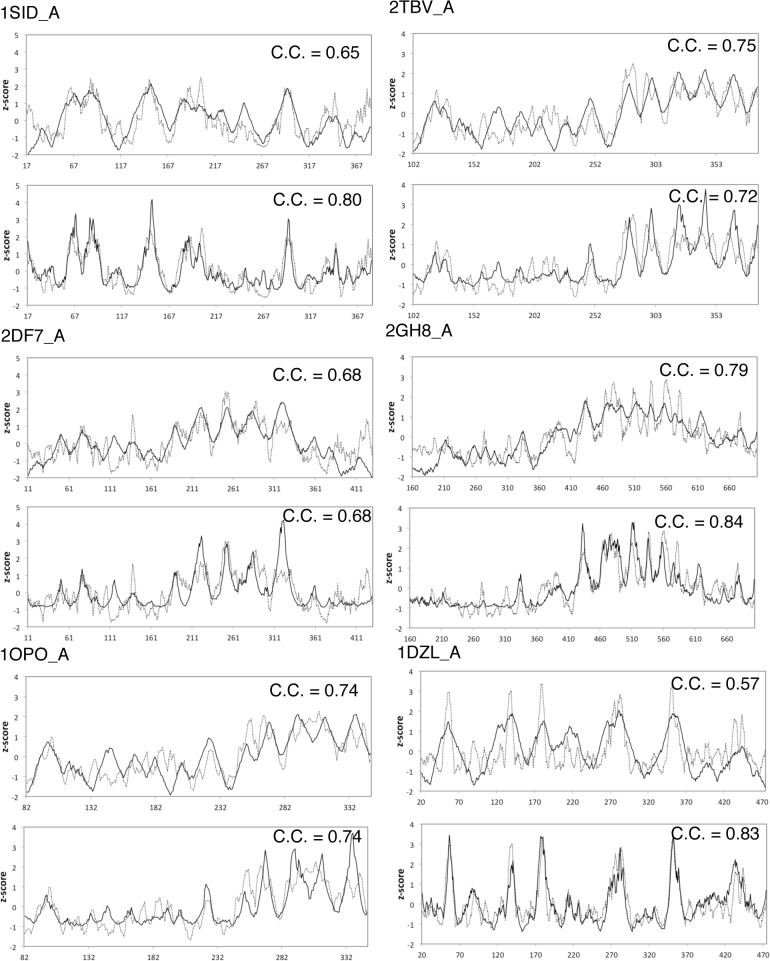
Fig 2. Comparison of profiles.
Each plot shows the radius distribution profile (solid line) and conservation profile (dotted line) (the top plot under the PDB ID) and the WCN profile (solid line) and the conservation profile (dotted line) (the bottom plot under the PDB ID). The Pearson’s correlation coefficient is shown on each plot.

