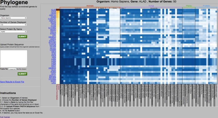
Figure 1.

Front page of the PhyloGene server. In the left pane, the user can submit the query and set up basic parameters. After the query is submitted, the output is shown in the right pane as a heatmap, with rows corresponding to phylogenetic profiles with highest similarity to the profile of the query (shown as the top row). In this example, human ALAD protein was used as a query to detect top 50 human proteins with the most similar phylogenic profiles. Hovering the cursor over an element of the heatmap brings up the information about this element: human protein (also shown on the left of the heatmap), genome where the closest protein homolog was analyzed (also shown on the bottom of the heatmap) and the similarity value between the human protein and its homolog in this genome. Two leftmost columns, with elements colored in yellow–red hue, represent Pearson correlation coefficient and statistical significance (Z-score) of the similarity to the query.
