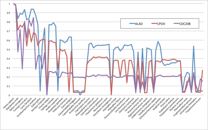
Figure 3.

Example of more detailed analysis based on numerical output of PhyloGene. The phylogenic profiles of ALAD (blue), CPOX (red), the profile with the highest similarity ALAD, and CDC20B (purple), the 51rd most similar protein profiles, were plotted as line graphs based on the values in the output table. The x-axis is the species (genomes) and the y-axis is the relative conservation values of proteins in these genomes compared to the human proteins.
