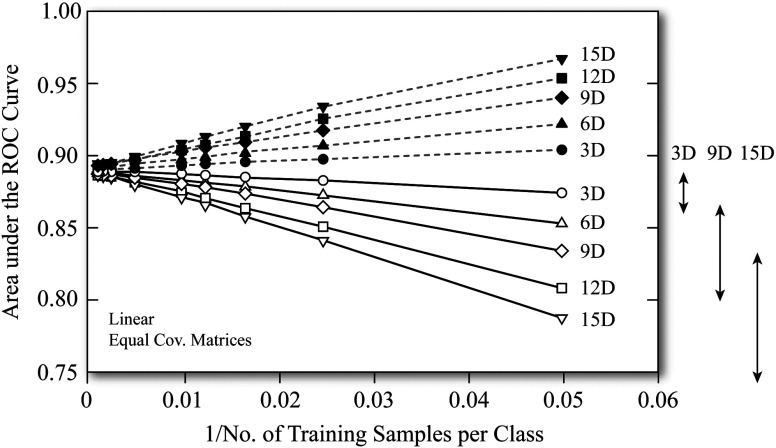
Figure 1.
One of Bob Wagner’s favorite plots, which he called the “antler plot,” depicting the interplay of classifier performance (here AUC on the ordinate axis) with dimensionality (varying from 3D to 15D in this illustrative example) and training sample size (abscissa axis) under two assessment paradigms: resubstitution (training and testing using the same dataset, dashed lines) and independent testing (solid lines). (Adopted from Ref. 7 with permission from Medical Physics Publishing.)

